Unconfigured Ad Widget

Collapse

Club Crest

Collapse
X
 
  • Time
  • Show
Clear All
new posts
  • MYU
    Administrator
    • Mar 2009
    • 43466

    #1

    Club Crest

    If you could design our club crest, what would it look like. Create one and post it up in here.
  • DeepcutHoop
    Gold Seat
    • Dec 2009
    • 6965

    #2
    Current one is actually close to being a decent design tbf, hoops on it, references to previous badges and local history,

    The crown is a bit OTT, and it doesn't need to be so 'shiny', but it's not bad at all.

    Comment

    • MYU
      Administrator
      • Mar 2009
      • 43466

      #3
      Originally posted by DeepcutHoop
      Current one is actually close to being a decent design tbf, hoops on it, references to previous badges and local history,

      The crown is a bit OTT, and it doesn't need to be so 'shiny', but it's not bad at all.
      I didn't like it before but I do now.

      Comment

      • Kirill
        W12 Seat
        • Mar 2009
        • 19359

        #4
        For all the h8rz of the current crest, you will love this one :


        Wait for it ....


        QPR
        1882
        Banning people is no longer my hobby,
        but take a look at my photo blog:

        http://kirillqpr.blogspot.com/

        How and why did I start supporting QPR in Estonia:
        http://www.wearetherangersboys.com/forum/blog.php?b=852

        Comment

        • Pie & mash
          Bronze Seat
          • Feb 2014
          • 483

          #5
          This is slightly better than what we have now
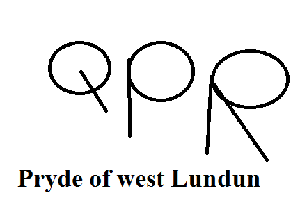

          I should probably write something insightful here

          Comment

          • brightonr
            Banned
            • Mar 2009
            • 10922

            #6
            I think QPR Report has bought up all the good ones just in case.

            Comment

            • Nick
              Gold Seat
              • Oct 2013
              • 5593

              #7
              Originally posted by Pie & mash
              This is slightly better than what we have now


              not wrong there mate!
              SIR LESLIE FERDINAND!!

              Comment

              • qpr4life
                Gold Seat
                • Apr 2009
                • 5044

                #8
                The current badge is actually quite good, in terms of capturing certain things about the club. E.g. The hoops, old badge style.

                The previous badge was of course with everyone for quite some time, but the decision to modify it was the right one IMO.

                Comment

                • Timmy the Doc
                  Silver Seat
                  • Jan 2012
                  • 3193

                  #9
                  Originally posted by DeepcutHoop
                  Current one is actually close to being a decent design tbf, hoops on it, references to previous badges and local history,

                  The crown is a bit OTT, and it doesn't need to be so 'shiny', but it's not bad at all.
                  Agree, it's maybe a king's crown.

                  Comment

                  • fisnik
                    Silver Seat
                    • Aug 2012
                    • 1224

                    #10
                    I personally like the current one. Yes it could be better with a few tweaks but nothing really that wrong with it. There's a lot of other badges that when you look at them you think what the hell. Our one is one of the better ones I think.

                    Comment

                    • vespa
                      Gang of Four Members
                      • Mar 2011
                      • 6903

                      #11
                      Originally posted by fisnik
                      I personally like the current one. Yes it could be better with a few tweaks but nothing really that wrong with it. There's a lot of other badges that when you look at them you think what the hell. Our one is one of the better ones I think.
                      The crown is the worst thing about it ,just pointless imo
                      Rangers,Scooters ,Tunes and Trainers

                      Comment

                      • QPRNW9
                        Apprentice
                        • Nov 2014
                        • 126

                        #12
                        The new crest has grown on me also. Quite like it. I like the football on the top, the connection with old badges and the inclusion of London at the bottom. I the crown on the top also,very Royal; almost like Real Madrid's Crown on their crest. We could use that part of the crest in many extra things. Good badge imo.
                        Last edited by QPRNW9; 17-11-2014, 05:25 PM.

                        Comment

                        • fisnik
                          Silver Seat
                          • Aug 2012
                          • 1224

                          #13
                          Originally posted by vespa
                          The crown is the worst thing about it ,just pointless imo
                          Yea I know, just because we got Queen in the name. But to be honest I think it was put in to add to the design more than anything. But maybe it's just me but it doesn't really bother me that much.

                          A lot people used to complain about the "Roman wings" on it, until it was explained that actually that was based on the old badge which did have the wings which also were on the Hammersmith borough badge.

                          Comment

                          • Brian Wilson
                            Silver Seat
                            • Jul 2009
                            • 4400

                            #14
                            Here ya go. I gave QPR Report full ownership rights so speak to him re:commercial use.

                            Comment

                            • Hertford Hoop
                              W12 Seat
                              • Mar 2009
                              • 15998

                              #15
                              I blew a lot on vodka and tonic, gambling and fags. Looking back, I think I overdid it on the tonic. - The one and only Stanley Bowles

                              Comment

                              Working...