Unconfigured Ad Widget

Collapse

I hope they don't change the badge

Collapse
X
 
  • Time
  • Show
Clear All
new posts
  • QPRDave
    The number 10
    • Mar 2009
    • 32079

    #16
    Originally posted by swede
    [/B]

    Nooooo, we`re QPR not Reading - it should be hoops on trunks and sleeves.
    don't you think thats a bit 70s/old fashion mate?

    Mind you i say 70s and then found this pic Which i do like,... white sleeves

    Comment

    • Gtleighsr3
      CCG
      • Mar 2009
      • 23569

      #17
      I think they should acknowledge the Force that is the CCG on the badge
      Chelmsford City the home of Radio

      Comment

      • TRING-RANGER
        Silver Seat
        • Feb 2012
        • 1849

        #18
        Originally posted by LoftusRoadLad
        Is this better ? :=):
        my dream kit.........

        Comment

        • swede
          Silver Seat
          • Mar 2009
          • 3135

          #19
          Originally posted by QPRDave
          don't you think thats a bit 70s/old fashion mate?

          Mind you i say 70s and then found this pic Which i do like,... white sleeves
          I really like the first one. Classic.

          Comment

          • QPRDave
            The number 10
            • Mar 2009
            • 32079

            #20
            yeah it does look good, but is that because the great maverick is in it?!! My fav no10

            Comment

            • 72bus
              Gold Seat
              • Mar 2011
              • 9519

              #21
              dont like the badge or shirt , love QPR

              Comment

              • Connell10
                Silver Seat
                • Mar 2011
                • 3468

                #22
                I think the main problem with the badge is a lot of fans still see the badge as a link to flabio and co! but as other posters have said now "THE BRAND" is out there i cant see them changing! the badge in itself isnt to bad if you took away the flabio grey pubic edging it would be ok but having said that i much prefer one of our old style badges! as for the kit mmmmm dont really like the thin hoops, to much white at the top and the neck looks naff so all in lotto have lived up to their normal crap they seem to produce for us! in fact they never seem to get it quite right do they?
                LONDON CALLING TO THE ZOMBIES OF DEATH.... ALSO KNOW AS BRENTFORD FANS

                Comment

                • QPR Rickson
                  Silver Seat
                  • May 2012
                  • 1527

                  #23
                  I gotta b honest I think this kit is one of the worst I've seen, and the new badge is crap. But the most important thing is the team winning and supporting them. When I was a kid I loved our old badge and still do.best kit for me was probly the Guinness top with the red trim.

                  Comment

                  • nuffieldranger
                    Silver Seat
                    • Mar 2009
                    • 2202

                    #24
                    love the new badge better than the old one if i am honest thats why i got the tatoo
                    Dyslexic so please don't feel the need to correct my spelling mistakes as I really don't give a **** and before you say use spell checker if it is spelt right / wright but not in context spell check is useless

                    Comment

                    • QPRDave
                      The number 10
                      • Mar 2009
                      • 32079

                      #25
                      [QUOTE=Connell10;899951]I think the main problem with the badge is a lot of fans still see the badge as a link to flabio and co! but as other posters have said now "THE BRAND" is out there i cant see them changing! the badge in itself isnt to bad if you took away the flabio grey pubic edging it would be ok but having said that i much prefer one of our old style badges! as for the kit mmmmm dont really like the thin hoops, to much white at the top and the neck looks naff so all in lotto have lived up to their normal crap they seem to produce for us! in fact they never seem to get it quite right do they?[/QUOTE]

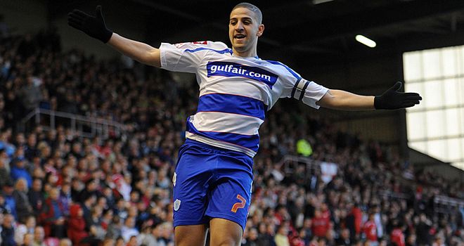
                      this one ain't bad is it?
                      Comment

                      • QPR Rickson
                        Silver Seat
                        • May 2012
                        • 1527

                        #26
                        Originally posted by nuffieldranger
                        love the new badge better than the old one if i am honest thats why i got the tatoo
                        Ive got the old 1 haha

                        Comment

                        • QPR Rickson
                          Silver Seat
                          • May 2012
                          • 1527

                          #27
                          I'm abit restricted now in the clubshop as I tend to buy the stuff with the old crest. Also has anyone seen how many Koreans are down there now. I go past the ground everyday and theres been a fair few taking pictures of it. Some wanted to go inside to look but the grounds getting a lick of paint so they were told they couldn't. I cant believe all of this just because of the park signing.

                          Comment

                          • Sleeping Giants
                            Silver Seat
                            • Mar 2009
                            • 3242

                            #28
                            Originally posted by TRING-RANGER
                            Our Badge looks cheap and tacky, and i dont like the new shirt , neither modern look will make the team perform any better
                            I agree 100%!.....The "on the field" stuff is obviously more important but our badge is tacky, our 2nd and 3rd kits are ridiculous....and our home shirt is wrong....I'm glad they are selling well in Asia coz I won't be buying one....Love what Tony's doing where it really matters tho!

                            Comment

                            • stanistheman
                              Platinum Seat
                              • Mar 2009
                              • 11151

                              #29
                              Not sure what is modern about thin hoops....QPR had them in the 70s but I don't think the kit was worn much. I don't like thin hoops or the tacky badge, but the badge will still be used for a few more years.

                              Comment

                              • QPRDave
                                The number 10
                                • Mar 2009
                                • 32079

                                #30
                                think Cardiff have more to complain about when it comes to badges/ strips

                                Comment

                                Working...