Unconfigured Ad Widget

Collapse

Old or Current Badge ?

Collapse
X
 
  • Time
  • Show
Clear All
new posts
  • paulmason
    Banned
    • Mar 2009
    • 7443

    #16
    Originally posted by andythefish
    Take the swirly bits off and you've got a better looking badge!
    Yep, thats the boutique stuff that needs erasing.

    Comment

    • kingy10
      Silver Seat
      • Mar 2009
      • 1629

      #17
      Missed out an option for couldn't really care less what the badge was as long as we sign some quality players?

      wink
      :drunk:

      Comment

      • Sleeping Giants
        Silver Seat
        • Mar 2009
        • 3211

        #18
        Old for me.....the current one is a monstrosity!

        Comment

        • robbomk
          Bronze Seat
          • Mar 2011
          • 287

          #19
          Think we may as well keep the new one. The new regime have enough to be getting on with.

          Comment

          • bushcelt1
            CCG
            • Sep 2009
            • 11070

            #20
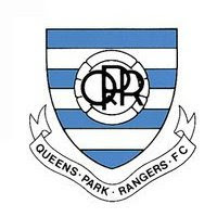
            the previous one over the new one all day long. still like the 70's shield badge-reminds me of going to rangers with my ol' man as a kid.
            PRIDE OF LONDON.

            Comment

            • Stanley
              Guest
              • Mar 2009
              • 23693

              #21
              Design-wise, the 70's one was the best and most original.

              A 21st century/retro version of it would look great.

              Comment

              • willis1980
                Silver Seat
                • Apr 2011
                • 1162

                #22
                anyone who votes for the current needs their head examining, it looks like something concocted by a **** art & design student on his fag break! Ill take the previous badge any day or the art deco style one from the 70s.

                Comment

                • qpr
                  Platinum Seat
                  • Mar 2009
                  • 10372

                  #23
                  Tony Fernandes just retweeted -

                  @tonyfernandes PS. also speaking on behalf of qpr fans, any chance of having our old badge back.

                  I don't get it QPR fans. The new badge looks good and is all over our ground and the shirts that have been printed. We don't need to spend thousands on the old badge when the new one looks good
                  Under Les Ferdinand:
                  Luke Freeman, top assists in the league: 4million
                  Alex Smithies, great goalie for this club: 3,5million
                  Charlie Austin, 19 Premier League goals: 4million
                  Jack Robinson: Contract ran out, left for free
                  And many more mistakes

                  LES FERDINAND, IT'S TIME TO GO

                  Comment

                  • Kit
                    Silver Seat
                    • Mar 2009
                    • 3747

                    #24
                    You have to look forward and remember, if we didn't change our badge every now and then, then in 20 years time what would be retro ? Its good to change and whilst I love the previous badge (which I have tattooed on my arm) I also think the new badge is the best thing FB and BE did in their time apart from appoint NW (think that was more Amit though).

                    Comment

                    • SullivanQPR
                      Bronze Seat
                      • Jul 2011
                      • 771

                      #25
                      Originally posted by Stanley76
                      Design-wise, the 70's one was the best and most original.

                      A 21st century/retro version of it would look great.

                      Agree.

                      Just jazz this one up a bit.
                      "Trust In Warnock" - Don't just type it - Do It.

                      Comment

                      • qprjames
                        Silver Seat
                        • Mar 2009
                        • 4353

                        #26
                        Originally posted by qpr
                        Tony Fernandes just retweeted -

                        @tonyfernandes PS. also speaking on behalf of qpr fans, any chance of having our old badge back.

                        I don't get it QPR fans. The new badge looks good and is all over our ground and the shirts that have been printed. We don't need to spend thousands on the old badge when the new one looks good
                        Now, Then, Forever
                        [CENTER]QPR-Football League CHAMPIONS

                        Comment

                        • Stanley
                          Guest
                          • Mar 2009
                          • 23693

                          #27
                          Originally posted by SullivanQPR
                          Agree.

                          Just jazz this one up a bit.
                          Thats the one - lets tweet him

                          Agreed its too late for this season of course.

                          Comment

                          • Shamie
                            Silver Seat
                            • Mar 2009
                            • 1718

                            #28
                            Originally posted by Connell10
                            this new badge reminds me to much of flabios and dwarf boys reign!! get rid of asap!!!!
                            Work is the curse of the drinking classes. -Oscar Wilde.

                            Comment

                            • Shamie
                              Silver Seat
                              • Mar 2009
                              • 1718

                              #29
                              Originally posted by qpr
                              Tony Fernandes just retweeted -

                              @tonyfernandes PS. also speaking on behalf of qpr fans, any chance of having our old badge back.

                              I don't get it QPR fans. The new badge looks good and is all over our ground and the shirts that have been printed. We don't need to spend thousands on the old badge when the new one looks good
                              The current one is a tacky,classless piece of sh ite.

                              Just like the C U Next Tuesday that foisted it upon us.
                              Work is the curse of the drinking classes. -Oscar Wilde.

                              Comment

                              • QPRDave
                                The number 10
                                • Mar 2009
                                • 32060

                                #30
                                Prefer the new one now. Lets go forward with this crest in the new era.Keep the old crests in the past and remember them fondly.

                                Comment

                                Working...