Unconfigured Ad Widget

Collapse

QPR’s 2019/20 kits revealed

Collapse
X
 
  • Time
  • Show
Clear All
new posts
  • QPRDave
    The number 10
    • Mar 2009
    • 32063

    #16
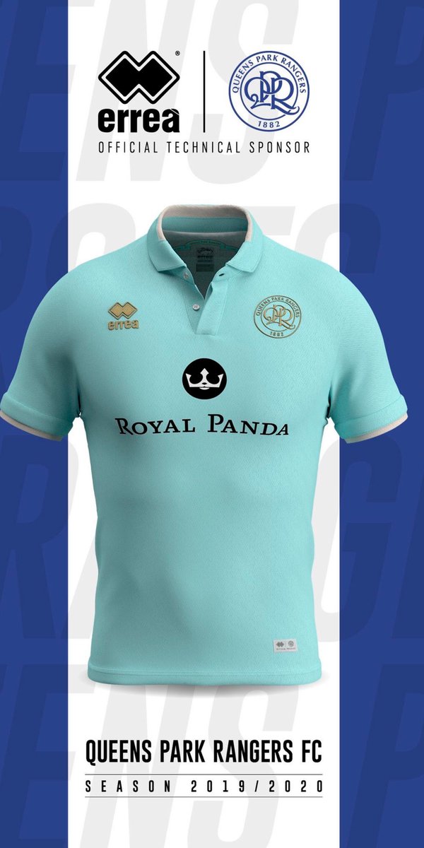
    We got this orrible mint material hanging the warehouse ....Ah i know

    Comment

    • Jeffqpr
      Silver Seat
      • Jun 2015
      • 1832

      #17
      Us of course

      Comment

      • LoftusRoadLad
        W12 Seat
        • Jan 2011
        • 19582

        #18
        101069_020_01.pngCan someone photoshop the gold to red just to see ?

        Comment

        • Fraggy
          Administrator
          • Aug 2010
          • 9715

          #19
          Originally posted by LoftusRoadLad
          101069_020_01.pngCan someone photoshop the gold to red just to see ?
          Wouldn't mind seeing a rendition of that with black trim also, like Rodman mentioned earlier in this thread.
          Minds Are Like Parachutes.
          Work Best When Open...
          @Nowt2SeeHere

          Comment

          • QPRDave
            The number 10
            • Mar 2009
            • 32063

            #20
            Originally posted by Jeffqpr
            Us of course
            Their's looks better than ours, imo, but I don't think we should
            have that as our kit colour anyway.
            Look like referees

            Comment

            • LoftusRoadLad
              W12 Seat
              • Jan 2011
              • 19582

              #21
              On the away kit it has white trim on the left sleeves and on the right gold

              Comment

              • QPRDave
                The number 10
                • Mar 2009
                • 32063

                #22
                Originally posted by LoftusRoadLad
                On the away kit it has white trim on the left sleeves and on the right gold
                Ran out of gold!!!.....Bit like QPR

                Comment

                • Joe90
                  Silver Seat
                  • Feb 2014
                  • 1080

                  #23
                  The collar is always so divisive. Personally I don't mind a collar, prefer it to a v-neck. Think the home kit is good just needs the red trim and letters/numbers on the back. Away kit looks like a training top. Sadly if you're a bit tubby these shirts ain't going to look good on you.

                  A basic home shirt is essentially a white top with three blue hoops all the way around. Any new design should build on that and only use red if you're going to have an extra colour.

                  Comment

                  • Shepherds Mush
                    Platinum Seat
                    • Nov 2012
                    • 10325

                    #24
                    Not a big fan of collars on football kits to be honest - would have preferred a v-neck.

                    Will probably buy them both when they are a fiver at the end of the season though...

                    Comment

                    • stanistheman
                      Platinum Seat
                      • Mar 2009
                      • 11151

                      #25
                      Originally posted by QPRDave
                      Who do you think got the better deal?

                      Carlisle.

                      QPR's one looks like a polo shirt rathn than a football one.

                      Comment

                      • QPRDave
                        The number 10
                        • Mar 2009
                        • 32063

                        #26
                        Agree Stanis

                        Comment

                        Working...