Unconfigured Ad Widget

Collapse

Announcement

Collapse
No announcement yet.

Is this the new kit?

Collapse
X
 
  • Filter
  • Time
  • Show
Clear All
new posts

  • #16
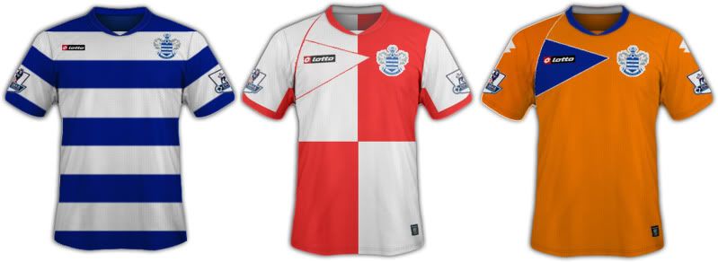
    Would prefer thicker hoops, but I'm happy to pay the price of thinner ones if the shirt is clean and simple rather than the garish cheap-looking dross that Lotto have given us and that some people on here seem to clamour for.

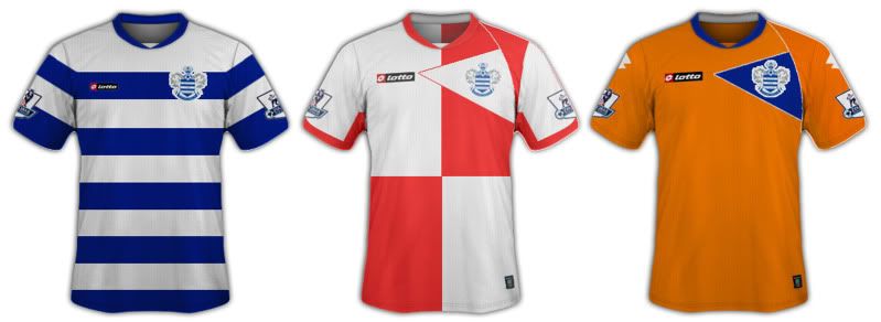
    Like the collar in that pic too.

    At the end of the day though a horrible sponsor will wreck even the nicest shirt, just look at Tottenham's new one.

    Comment


    • #17
      Originally posted by rangersbitch View Post
      Yeah, terrible. A blue and white hooped shirt with no fiddly bits or silly trim. That'd be awful. Like a throw back to the appalling shirts of the 60s and 70s.

      Comment


      • #18
        Originally posted by Simonj10 View Post
        Which way round is the red and white halves is it white then red or red then white?
        If you read the post, it says QUARTERS.
        Queens Park Rangers
        NPower Champions 2010/2011

        PREMIER LEAGUE 2011 - ETERNITY (Oh well got that wrong, we'll be back though)

        Comment


        • #19
          Originally posted by 80sCasual View Post
          If you read the post, it says QUARTERS.
          and if you read my post am asking which way round it is? does it go red then white, maybe i missed in the top half of the quarters

          Comment


          • #20
            simon - just get on and design it

            Comment


            • #21

              Comment


              • #22
                Originally posted by Simonj10 View Post

                Would look good.
                Queens Park Rangers
                NPower Champions 2010/2011

                PREMIER LEAGUE 2011 - ETERNITY (Oh well got that wrong, we'll be back though)

                Comment


                • #23
                  Well done, not sure how the sponsor will look on the first. Take away the red lined triangle on the second. and take away the blue triangle on the third and replace it with a couple of blue hoops.

                  Cheers mate, you are pretty good.

                  Comment


                  • #24
                    Originally posted by simonQPR View Post
                    Well done, not sure how the sponsor will look on the first. Take away the red lined triangle on the second. and take away the blue triangle on the third and replace it with a couple of blue hoops.

                    Cheers mate, you are pretty good.
                    From what i have been told and this is not ITK but the triangles will be on both away and 3rd kit as is a standard for all lotto kits this year

                    Comment


                    • #25
                      Here we go this is what i have been told is the new kit well a close version of anyway

                      Comment


                      • #26
                        They look nice. Not a big fan of the orange though, looks like we've been tangoed...or worse, copying the fake hoops from a year or two ago.

                        We need the Dennis the menace hoops back! The perfect QPR away kit.

                        Comment


                        • #27
                          Originally posted by Simonj10 View Post
                          Here we go this is what i have been told is the new kit well a close version of anyway

                          I like them, even the orange one!!!

                          Comment


                          • #28
                            If they are the kits for next season, then they ain't too bad, I like them.
                            Opinions are like A******s, everyone has one, but nobody wants to see the other guy's.
                            -----------------------------------------------------------------
                            https://twitter.com/#!/QPRBOB

                            Comment

                            Working...
                            X