-
-
Green and black reminds me of those hard boiled chocolate mint sweets.Leave a comment:
-
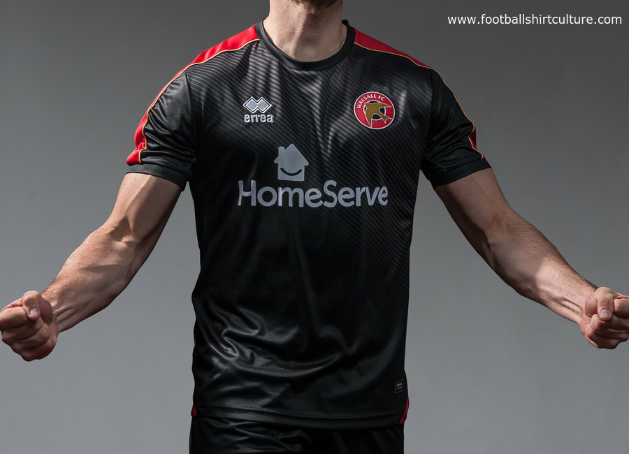
Errea have done a nice job on the Walsall kits for next season. If our kits are along these lines i'll be happy!
Leave a comment:
-
Green and black sounds interesting. Sounds much better than the burgundy monstrosity last season.Leave a comment:
-
-
Yes, can't be paying full whack or silly prices. I do like to see what the shirt I'll be buying off eBay in 2 or 3 years for a fiver looks like though! Not sure about even a bit of red.... blue and white hoops require no breaking up or fancy bits in my view.
Bit worried about Royal Panda - think there's an anagram in there somewhere with the words PONY and LARD in it??? Someone with more brains than me will probably come up with a corker.Leave a comment:
-
Nice one Jim. I don't buy shirts myself tbf but round collar and a bit of red breaking up the strips sounds decent.Leave a comment:
-
Assume we'll be getting another one of those big reveal evenings that the club likes to put on.Leave a comment:
-
Is the sponsor logo like this?

If it is I like it. Clever use of the negative space for the panda eye.Leave a comment:
-
Sponsored by an online casino? Well, we do a lot of gambling and losing, I supppose.......Leave a comment:
-
*New kit 2017/18*
Just bumped into a mate who works for Errea and he's shown me the 3 new kits for the season.
Home kit is a round collar, 3 blue hoops, 4 white.
Away kit is a round collar Dennis the menace kit of red / black
Third kit is a round collar with green and black hoops.
Sponsor is Royal Panda
Inside the neck it says #WEAREQPR
He has asked me not to post them up for obvious reasons. Not fair on QPR or Errea.
Looks nice if a little plain. I think the home kit benefits from a tiny bit of red to break it up but it does look kind of retro'ish too.




Leave a comment: